Customizing generated Windows 10 app with cool features
In this walkthrough, we are going to customize a Windows App Studio generated app by using Visual Studio 2015 Community Edition to add some cool features.
Download proyect: Github or Store
Step 1
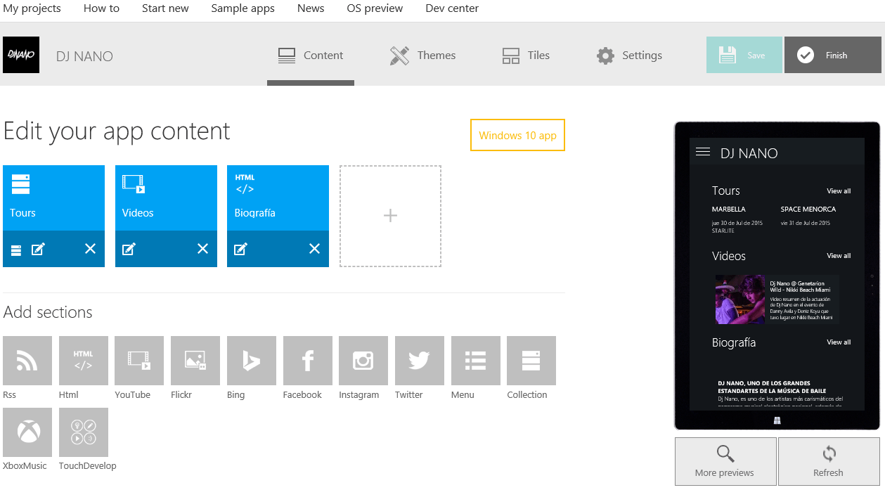
Navigate to Windows App Studio and create an app targeting Windows 10. Once you do that, then add the content you want to use. For the sample, we will create a DJ NANO app utilizing three sections: Tours, Videos, and Biography. We used the Collection section for Tours, a YouTube section for Videos, and custom HTML section for Biography content.
For the Tours section we will use the “TextCard” layout and for the Videos section, we will use the “BigHorizontalCardBox”.
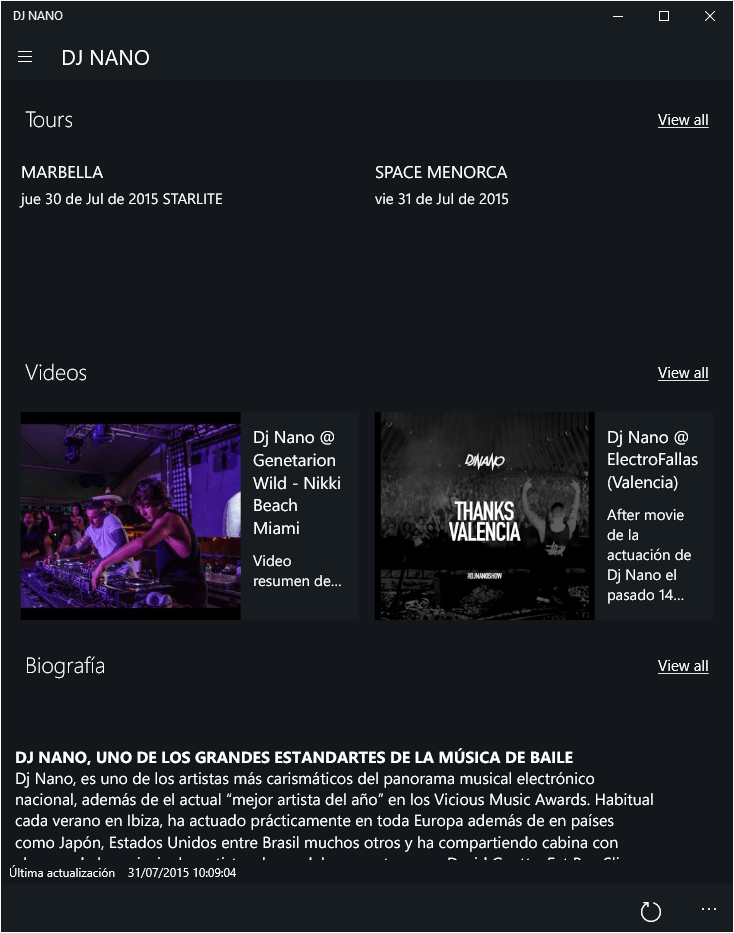
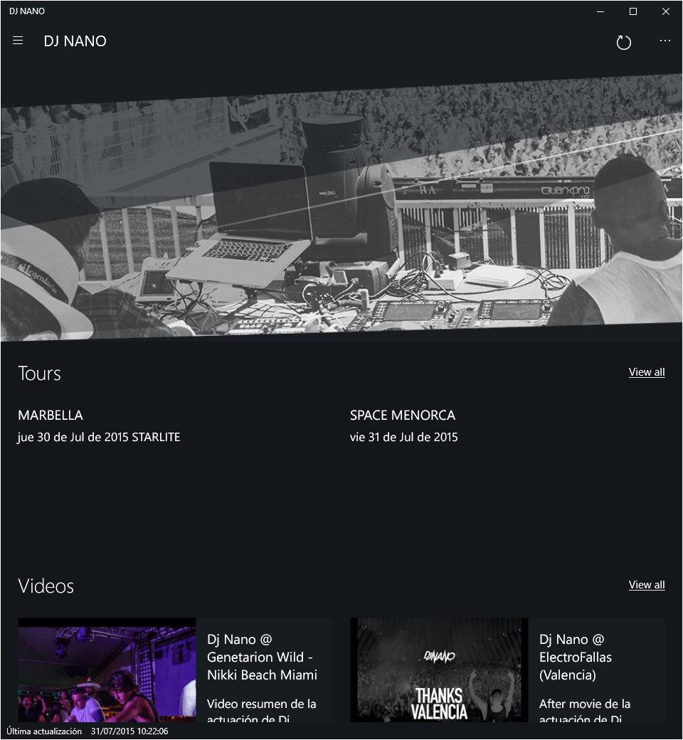
Once configured, our app looks like the following:
Step 2
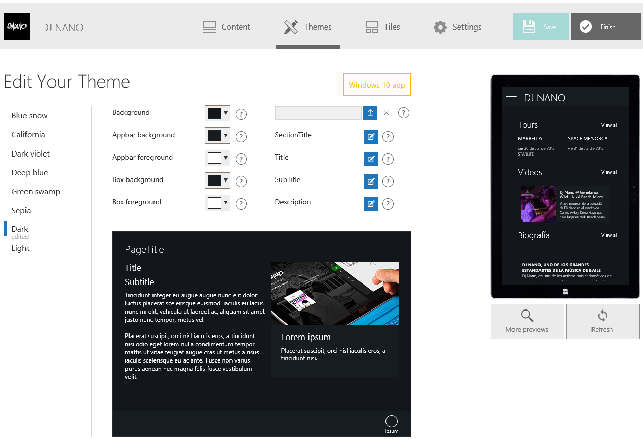
Now, we will customize the application themes. First, we added specific RGB colors for AppBackground, AppBar, and Boxes. Then we will use this RGB colors to customize more visual features on Visual Studio after the application source code is generated.
Step 3
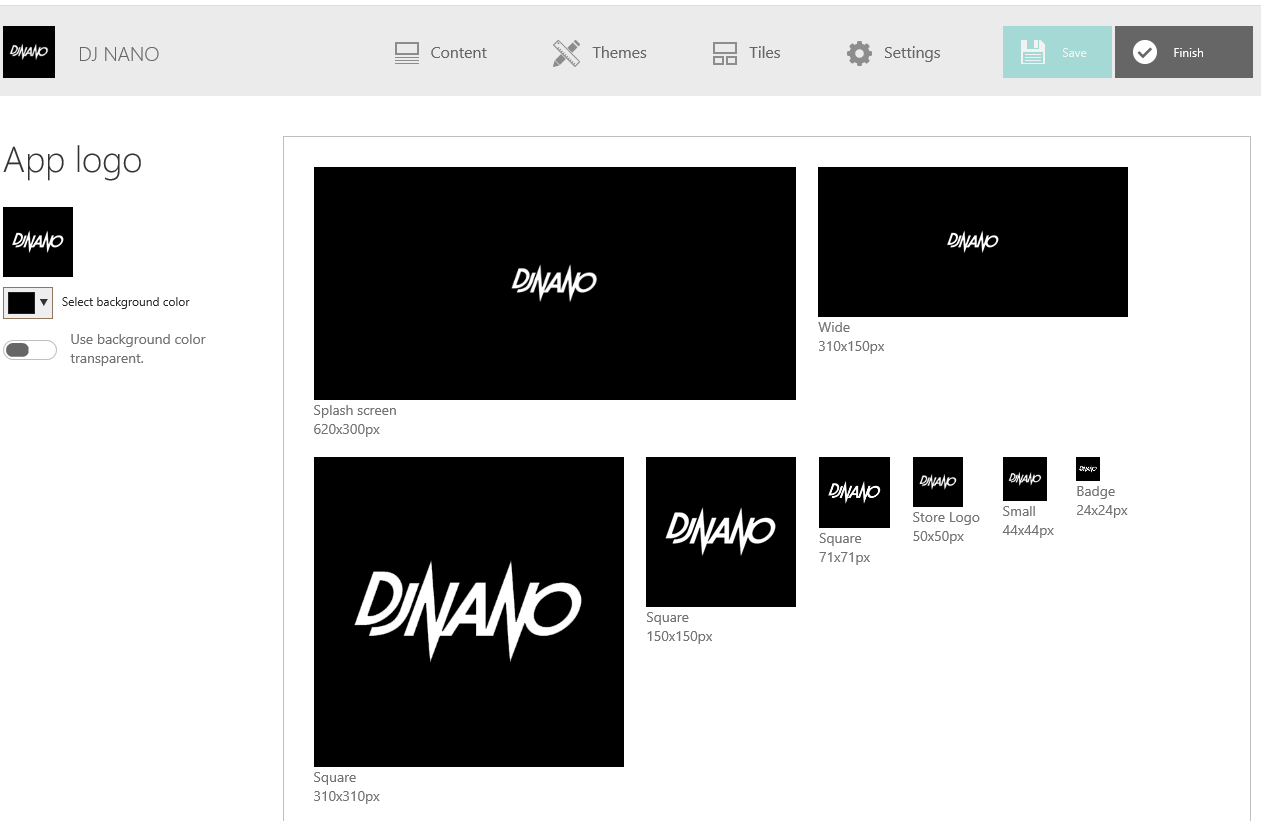
For the next step, we will configure the application’s Tiles. Use the Logo editor to create all the required image assets with a single picture. Pretty neat, huh?
Step 4
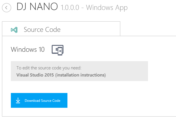
Now generate the app, download the source code package, and open the “.sln” (solution file) with Visual Studio 2015. If you don’t already have Visual Studio 2015, you can download Visual Studio 2015 Community Edition for free. If you need help, check the installation instructions here.
Work with Visual Studio 2015
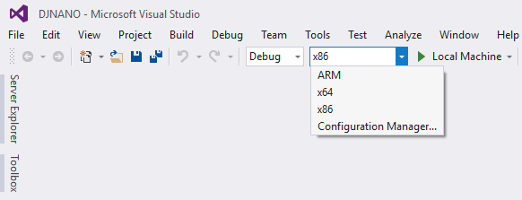
First, we need to set the x86 build configuration to be able to deploy the application in our local machine (Windows 10 PC). If you want to deploy the application to a Windows 10 Mobile device or emulator (still in preview) you need to choose ARM.
Compile and run the solution in Visual Studio to view and run the generated app. The app is optimized to have a great experience on all screen sizes, adapting list layouts and font sizes to perfectly suit the given resolution. This adaptive design is based on the Windows App Studio XAML controls, available as NuGet packages. You can access the source code as well in the WASTeam GitHub repo. Pull requests are always welcomed!
Now we will begin our app customization process.
Hero Image
First, we will add a hero (large, headline) image at the top of the section list and stretch this to the app margins.
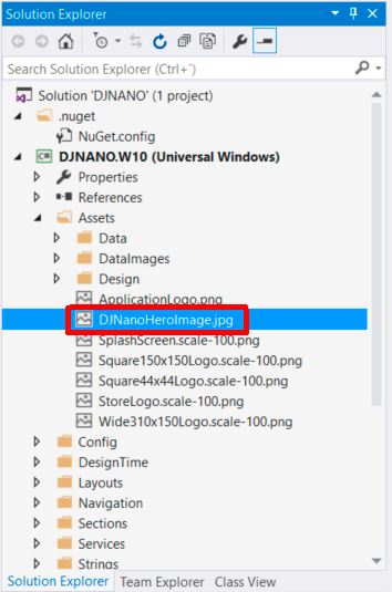
To do this we will modify the application source code. First, add the image file to Assets folder in Visual Studio. Assets folder exist in all Visual Studio XAML projects by default, and the purpose of this folder is to contain all media files to be used by the project (images, videos, sounds).
Find, select, and modify the HomePage.xaml file to add a new section on top of the list. Let’s make it appear before Tours.
Next, update SectionListItem properties in XAML to disable title, error and loading features. Then add the image inside the DataTemplate. Now, set the image properties with the following: the Source pointing to the added file, Strech to UniformToFill and MaxHeight to 400.
<was_controls:SectionListItem
    HeaderLinkVisibility="Collapsed"
    TitleVisibility="Collapsed"
    ErrorVisibility="Collapsed"
    LoadingVisibility="Collapsed"
    ManageLoading="False">
    <DataTemplate>
        <Grid MaxHeight="300">
            <Image Source="/Assets/DjNanoHeroImage.jpg"
                   Stretch="UniformToFill" MaxHeight="400"/>
        </Grid>
    </DataTemplate>
</was_controls:SectionListItem>
The top of the image will match the same RGB color used for AppBar which leads to a smooth design.
Next, we are going to set the same color of hero image AppBar to the Tours Section.
Modify the background property on Tours SectionListItem referencing the AppBar background as static resource. See the code below.
<was_controls:SectionListItem
    DataContext="{Binding Tours}"
    HeaderLinkClickCommand="{Binding SectionHeaderClickCommand}"
    Background="{StaticResource AppBackground}"
    HeaderLinkVisibility="Visible"
    ErrorVisibility="{Binding HasLoadDataErrors, Converter={StaticResource BoolToVisibilityConverter}, FallbackValue=Collapsed}"
    LoadingVisibility="{Binding IsBusy, Converter={StaticResource BoolToVisibilityConverter}, FallbackValue=Collapsed}"
    d:DataContext="{d:DesignData Source=/Assets/Design/DesignData.json, Type=vm:DesignViewModel, IsDesignTimeCreatable=true}">
    <DataTemplate>
        <list_layouts:ListTextCard DataContext="{Binding}" ItemsSource="{Binding Items}" ItemClickCommand="{Binding ItemClickCommand}" OneRowModeEnabled="True" Margin="14,0,6,0"/>
    </DataTemplate>
</was_controls:SectionListItem>

As you can see once you scroll down, the Hero image disappears, improving the UX. The hero Image is fully integrated with the App design and follows the Windows 10 design guidelines.
ListTour
Now, we are going to introduce some code changes to create a new ListLayout for Tours section. TextCard is a little too big and is ill-suited for tour information. Create a ListTour from a copy of ListTextCard in the Layout/List project folder. Right click on ListTextCard, select Copy, then paste in the same folder (Layout/List). Next, rename ListTextCard – Copy.xaml to ListTour.xaml. After, you then must to access the XAML file and change the x:Class property replacing ListTextCard with ListTours. Do the same on the .cs file for the class name and class constructor.
The layout will have exactly the same XAML code, but it now references to a new VisualBreakPoints configuration file.
<UserControl.Resources>
        <was_controls:VisualBreakpoints x:Name="vbp" ConfigFile="/Layouts/List/Breakpoints.Large.ListTour.json"/>
    </UserControl.Resources>
Create a ListTour JSON file by copying the ListTextCard JSON file and updating all the break points by setting itemsHeight properties to 60% of current value (more or less).
Finally, update the HomePage.xaml to replace the List layout of TourSection
<was_controls:SectionListItem
    DataContext="{Binding Tours}"
    HeaderLinkClickCommand="{Binding SectionHeaderClickCommand}"
    Background="{StaticResource AppBackground}"
    HeaderLinkVisibility="Visible"
    ErrorVisibility="{Binding HasLoadDataErrors, Converter={StaticResource BoolToVisibilityConverter}, FallbackValue=Collapsed}"
    LoadingVisibility="{Binding IsBusy, Converter={StaticResource BoolToVisibilityConverter}, FallbackValue=Collapsed}"
    d:DataContext="{d:DesignData Source=/Assets/Design/DesignData.json, Type=vm:DesignViewModel, IsDesignTimeCreatable=true}">
    <DataTemplate>
        <list_layouts:ListTour DataContext="{Binding}" ItemsSource="{Binding Items}" ItemClickCommand="{Binding ItemClickCommand}" OneRowModeEnabled="True" Margin="14,0,6,0"/>
    </DataTemplate>
</was_controls:SectionListItem>
Awesome! You should be all done now! To summarize, we have extended a Windows 10 application in barely an hour of programming time, giving us a richer user experience. With the Hero image, we can have better and more stylish visual impact. We also have improved the design of our app using light colors changes between the Hero image, AppBar, and section background. Finally, with the creation of the custom list layouts we have optimized our content views.
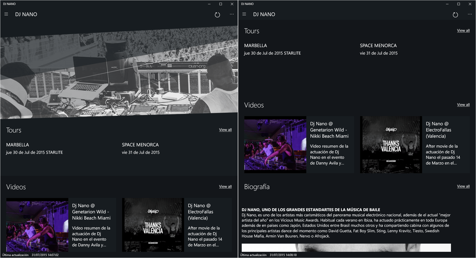
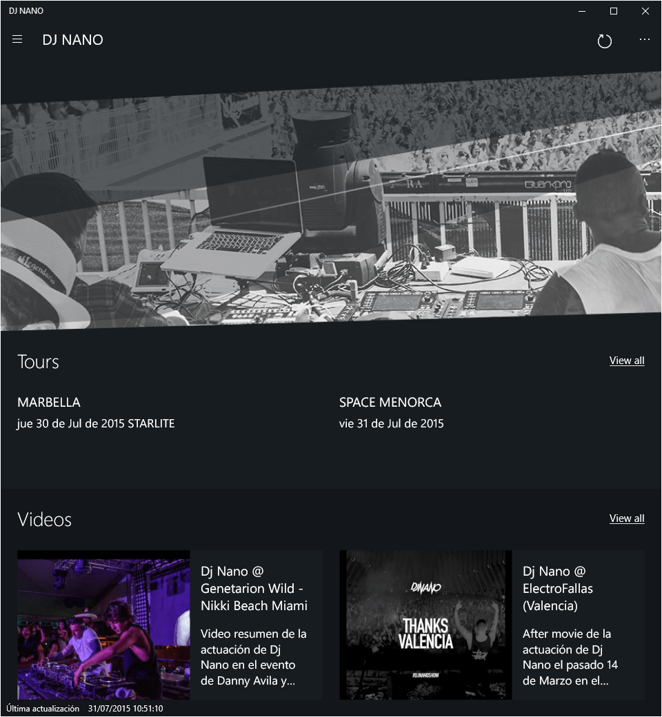
Check the results by comparing the customized version (left side) and the original generated app (right side) side by side below. Pretty cool, right?